
The types of social media content that work are not the same on every platform, and that is the whole problem. A post built for Instagram and reposted to X arrives in a feed with different rules, a different audience and different dimensions, which is why it underperforms in both.
Each platform has its own visual language. Adapting to it is not a refinement; it is the difference between a post that gets seen and one that scrolls past. What follows covers the formats that work on Facebook, Instagram and X, with the dimensions each one currently expects.
It also covers how to make decent-looking content without a designer, and how to tell afterwards whether any of it worked, which is the part most guides leave out.
By the end you should have a map of what to create for which platform, rather than a list of formats with no instruction about where they belong.
What counts as visual content, and why it decides the outcome
Visual content is any graphic, photographic or audiovisual piece published on a social platform. The definition is broad and the standard is not: in a feed that never ends, the image is what determines whether anyone reads the caption at all.
Attention on these platforms is measured in a second or two. That is the window in which someone decides to stop or keep moving, and nothing in the caption can recover a decision already made by the image.
The platforms have moved in the same direction for a decade. Instagram began as nothing but images, Facebook pushes native video over links, and X — which started as a text product — now surfaces posts with media over posts without it.
Original visual work outperforms stock photography consistently enough that it is worth treating as settled, though the published figures on how much vary wildly and most of them trace back to a single vendor’s blog post. The mechanism is not mysterious: audiences have seen the stock library, and recognizing an image from somewhere else is enough to break the attention the post was trying to earn.
Platform algorithms amplify what produces interaction, so the effect compounds. A post that stops people generates the signals that get it shown to more people, which is why the gap between good and adequate visual content is wider than the effort difference suggests.
One caution before using anything you did not make: check where it came from. An image lifted from a search results page belongs to somebody, and a rights claim lands on the domain displaying it, not on whoever found it.
Visual consistency, and what happens without it
Consistency is what makes a post recognizable before the account name is read. Colours, typography and treatment doing the work that a logo used to do, in a feed where the logo is four millimetres wide.
It does not mean publishing the same thing everywhere. It means the same design rules applied across different formats: one palette, one or two typefaces, a consistent treatment of photography. The format changes per platform; the rules do not.
When this holds, the account reads as a business with someone in charge of it. When it does not, the identity dissolves into the feed, and the cost is not aesthetic — it is that people stop recognizing you between posts.
Publishing without visual rules is the equivalent of speaking in a different voice each day. It also tends to come from the shortcut of posting identical content everywhere to save time, which produces a feed that is consistent and wrong rather than adapted and right.
None of this is creative rigidity. A clear framework is what makes experimenting safe, because the experiments stay recognizably yours. That is the difference between brands people remember and brands they have seen.
| What suffers | When consistency is missing |
|---|---|
| Recognition | People do not connect one post to the next |
| Credibility | The account reads as improvised |
| Engagement | Fewer interactions, and fewer of them from returning viewers |
| Identity | The message dissolves into surrounding content |
Adapting content to each platform
Knowing the formats is half of it. The other half is knowing how content is consumed in each place, because the same image performs differently depending on what surrounds it and what the viewer arrived expecting.
The differences are not only technical. Each platform has a personality and an audience, and what works on TikTok frequently fails on Facebook for reasons that have nothing to do with quality. Treating them as interchangeable surfaces is the most common and most expensive assumption in social media.
How the platforms differ
Instagram rewards aesthetics: content there has to look considered. Facebook favours posts that explain or entertain, in a more relaxed register and with an older audience than most brands assume. X runs on speed and commentary, where a short image with a sharp line beats a careful composition.
The native formats differ too. On Instagram, vertical is now the default — the feed and grid favour 4:5, and Stories and Reels are 9:16. Square still works and no longer gets the best treatment, which is a change from a few years ago and one many brands have not updated for. On X, one image with a short line of text usually outperforms a longer post.
Why platform-specific content is worth the extra work
Adapting raises engagement because you are using the visual language the audience already reads, and it raises organic reach because the algorithms favour native formats over reposted ones. Both effects are measurable within a few weeks.
It also does not mean starting from scratch each time. The workable method is one master piece adapted deliberately: the same idea, recut to the right ratio, with the text rewritten for the register of each platform. That is twenty minutes per platform, not a new production.
Brands that work this way end up with a presence across several platforms that still looks like one brand, which is the only version of multiplatform that is worth the effort.
Types of social media content that work on Facebook
Facebook remains effective for image-led posts, with an audience that reads more text than Instagram’s and responds to content that explains something. Four formats account for most of what performs.
Infographics
Infographics make dense information digestible, and they have one practical problem: they are tall, so the feed crops them. The way round it is a reduced version at 1200 × 630 pixels as the post image, linking to the full graphic on your own site.
That also turns the format into a lead source. Offering the complete version as a download in exchange for an email address uses the same asset twice: once for reach and once for the list.
Charts and data visualizations
Charts build authority faster than claims do, provided the data is yours or properly attributed. The same 1200 × 630 frame applies, and the useful discipline is one idea per chart: a graphic that needs a paragraph of explanation has already failed in a feed.
Avoid publishing data without a point. A chart that shows something true and uninteresting generates no engagement and adds nothing but visual noise.
Memes, when they are yours
Memes work on Facebook when they are original and specific to your audience’s situation. Reposting a popular one gets nothing; making one about the thing only your customers find funny gets shared, and a small logo in the corner means each share carries the brand.
Link images for blog posts
A designed image at 1200 × 630 with faces, a short headline and clear contrast outperforms the automatic preview a link generates. The automatic version is a thumbnail; the designed version is a small advertisement for the article.
What makes any of these work over time is recording what you did. Note the format, the design approach and the numbers it produced. After three months that record is worth more than any published guide, because it is about your audience rather than an average one.
Formats that work on Instagram
Instagram is where visual standards are highest, and where content that looks rushed disappears fastest. Three formats carry most brand accounts.
Product images with actual design around them
A product photo on its own is a catalogue entry. The versions that perform treat the frame as a design: a considered background, a colour palette, graphic detail that gives the product a context. Flat, pastel-background treatments have been popular for years because they are cheap to produce and consistent to repeat.
None of this needs a studio. A recent phone camera, window light and a plain backdrop produce better results than a studio shot with no art direction. The variable is the design decision, not the equipment.
Real photographs of real people
Photographs of your team and your customers outperform anything staged, because recognizability is the thing stock imagery cannot buy. They also give an account a texture that product shots alone never produce.
Avoid generic stock entirely here. Audiences identify it immediately, and the cost is not a weak post but a loss of trust that carries over to the next one.
Quote graphics, used sparingly
Quote graphics are easy to make and easy to share, which is both the appeal and the trap. They work when the line genuinely reflects what your audience believes, and they read as filler when they are inspirational wallpaper with a logo attached.
If you use them, the typography has to carry it: legible at thumbnail size, strong contrast, and the same typeface you use everywhere else. A quote graphic in a typeface you have never used before is a post from somebody else’s account.
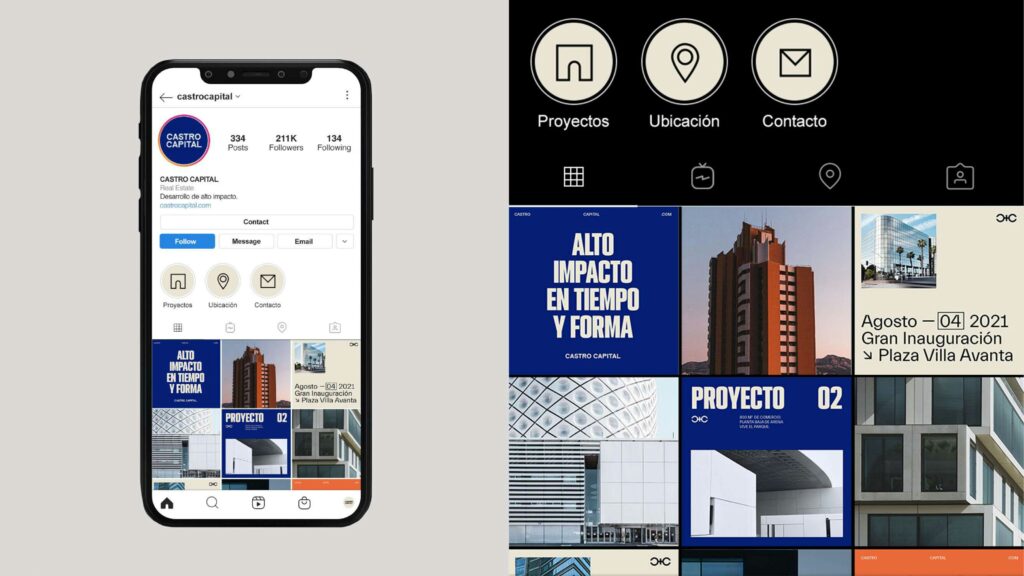
Across all three formats, the grid is the real unit of design on Instagram. Individual posts are seen in context with the eight around them, which means the palette matters more here than on any other platform.

Content that works on X
X started as a text product and no longer behaves like one. Posts with media get surfaced over posts without, which means a brand publishing only text is competing with a handicap it did not choose.
Three approaches cover most of what works there:
Text inside the image, for messages that need more room
The character limit still shapes everything on X, and putting a short line of text inside the image is how to say more without writing a thread. Use a 16:9 frame — 1600 × 900 pixels is a safe size — rather than the small card dimensions that older guides still recommend, which now display cropped or soft.
Avoid generic or low-resolution images here specifically. The feed moves fast enough that a blurry visual is worse than no visual, because it signals the post was assembled rather than made.
Short video
Video performs well on X and the consumption pattern rewards brevity: under a minute, often well under. These should be direct to the point, captioned, and watchable with the sound off, since most of the feed is viewed silently.
Treat each one like a post rather than a film. If the first two seconds do not establish what this is, the rest was not seen.
Your own GIFs
GIFs are the cheapest dynamic format available when there is no time to shoot video. Making your own with your brand mark included beats sharing a popular one, because the popular one carries somebody else’s reference and none of your recognition.
They also survive being reshared in a way static images do not, which is the only format advantage X still has over the other platforms.
The common thread on X is speed: designs legible at a glance, video that starts where it means to, and humour that reinforces the brand rather than borrowing someone else’s.
Measuring it, and adapting what you publish
Publishing without measuring produces activity rather than strategy. The numbers do not need to be sophisticated — four of them are enough — but they need to be recorded against what was published, which is the step that almost never happens.
Reach, interactions, link clicks and shares cover it. Each answers a different question: whether it was distributed, whether it landed, whether it moved anyone off the platform, and whether anyone thought it was worth passing on.
Tracking what actually happened
Record each post with its format, design approach, publication time and caption. When a post gets nothing, that is data rather than failure: note that this format did not work for this audience at this time, and keep going. The accumulated record is what makes the next decision less of a guess.
Testing continuously, because the platforms change
Keep the record for every post and within a few months you have a manual specific to your audience, which is worth more than any benchmark. Changing the approach as the results come in is not inconsistency; the formats the platforms favour shift every year or two, and an account that never adapts is optimizing for a feed that no longer exists.
Timing belongs in the same record. The windows when a specific audience is receptive are not the ones in the published studies, and the only way to find them is to note the hour alongside the result.
| Metric | The question it answers |
|---|---|
| Reach | How many people were shown the post |
| Interactions | Whether it landed with the people who saw it |
| Link clicks | Whether anyone moved off the platform |
| Shares | Whether it was worth passing on |
Design as the thing that separates accounts
In a feed where everyone has access to the same tools, design quality is one of the few remaining differences that a viewer registers instantly. Each post is either building a recognizable identity or spending attention without accumulating anything.
Investing in it is not about producing attractive images. It is that consistent quality reads as competence, and competence is what makes someone trust a company they have only seen in a feed.
Which is the argument for doing fewer posts properly rather than more posts quickly. An account publishing three considered pieces a week accumulates recognition; one publishing daily without a framework accumulates volume, and the two are not the same asset. The rest of what a content plan has to decide sits around this choice.
Frequently asked questions
What counts as visual content, and why does it matter?
Any image, video or graphic published on a social platform. It matters because in a feed the image decides whether the caption gets read at all, which makes it the first and often the only thing a viewer evaluates.
How do you keep visual content consistent?
Fix the rules rather than the output: one colour palette, one or two typefaces, a consistent treatment of photography. Then apply those rules across different formats per platform instead of publishing the same file everywhere.
Which tools make decent content without a designer?
Canva and Visme both produce acceptable results without design training, and both have free tiers sufficient to find out whether you will use them. The constraint is rarely the tool; it is having decided the palette and the typefaces beforehand.
Why does design quality matter on social media?
Because everyone has the same tools, so execution is one of the few differences a viewer notices in the second they spend deciding. Consistent quality reads as a company that is run properly, and that inference happens whether or not it is fair.