
Social media video specs change, and Instagram just changed the most important one. The supported range for feed images and video now runs from 1.91:1 up to 3:4 — 1080 pixels wide by up to 1440 tall — which replaces 4:5 (1080 × 1350) as the tallest format the platform accepts. Instagram’s own documentation confirms it.
That matters more than it sounds. The taller frame fills more of a phone screen, and on a platform where the only competition is the next post down, screen area is reach. What follows is every size that matters for feed, Stories, Reels and ads, plus the safe zones and the one ad rule most guides are still repeating years after it was withdrawn.
There are tables of sizes, the areas to keep text and logos out of, and the technical minimums for video. If you have ever uploaded something that came out soft or cropped, the cause is almost certainly in here.
One caveat worth stating up front: platforms revise these without announcing it. Everything below reflects what Instagram documents now, and anything that looks surprising is worth confirming in the app before producing a batch of content around it.
Why the sizes decide the result
Every upload gets interpreted. Instagram compresses and rescales according to the surface — feed, Stories, Reels — and the device. Supply the wrong dimensions and you lose sharpness, framing and legibility in one step, and none of it is recoverable afterwards.
The distribution side matters too: content built for full screen holds attention longer, and holding attention is what the ranking responds to. The specifics:
- Wrong dimensions get cropped, and the crop is automatic rather than considered.
- An undersized file gets upscaled to 320 pixels wide, which is where visible pixelation comes from.
- A post that fills less of the screen competes worse, independent of its quality.
- Text outside the safe zone is covered by the interface, so the message simply is not delivered.
- Faces, logos and calls to action cropped at the edge read as carelessness rather than as a technical error.
- Designing from the final size rather than resizing at the end removes most of this work permanently.
None of it is cosmetic. The sizes determine whether the thing you made is the thing anyone sees.
| Content | Recommended size | Ratio |
|---|---|---|
| Feed posts | 1080 × 1440 px | Vertical 3:4 |
| Stories | 1080 × 1920 px | Vertical 9:16 |
| Reels | 1080 × 1920 px | Vertical 9:16 |
The 3:4 feed change, and what it replaced
The feed now supports up to 1080 × 1440 pixels (3:4). The previous ceiling, 1080 × 1350 (4:5), still works and is still displayed correctly — it is simply no longer the tallest option available.
The difference looks small written down and is not small on a screen. 3:4 occupies noticeably more of a phone display, which means more of the viewport is yours and less of it belongs to whatever is above and below.
1080 × 1440 (3:4) against 1080 × 1350 (4:5)
The gain is vertical space. 4:5 leaves a margin; 3:4 removes most of it. For anything where the subject benefits from height — a person, a product shot, a stack of text — that margin was working against you.
- 1080 × 1440 is now the ceiling, and worth moving templates to.
- The taller frame holds a scrolling viewer marginally longer, which compounds across a feed.
- It suits products and tutorials, where cramped text is the usual failure.
- It is also close to the native ratio of many phone cameras, so less gets thrown away in the crop.
- Keep 4:5 as a fallback rather than as the default.
Why vertical wins in the current feed
Three practical reasons, in order of how much they matter:
- More screen area per post, which is the only variable here you fully control.
- Content that fits the screen natively performs better in distribution than content the platform has to adapt.
- Better-fitting posts collect more interaction, and interaction is what determines who else gets shown the post.
| Format | Size | Ratio |
|---|---|---|
| Current ceiling | 1080 × 1440 px | 3:4 |
| Previous ceiling | 1080 × 1350 px | 4:5 |
| Widest supported | 1080 × 566 px | 1.91:1 |
Profile picture and story highlight covers
These are the first things anyone sees and the most commonly neglected, mostly because they are small enough to seem unimportant.
Profile picture size
The display size is around 110 × 110 pixels, but upload at 320 × 320 or larger. Instagram compresses on upload, so supplying the display size guarantees a soft result on a high-density screen.
It renders as a circle, so centre the subject and keep anything that matters away from the corners, which will be cut off entirely.
Highlight covers
The circular icons under the bio. Design them at 640 × 640 pixels (1:1) and centre everything, because the same circular crop applies.
A few things that make the difference:
- Keep highlight covers to one simple shape or icon each. Detail disappears at that size, and a busy cover reads as a smudge.
- Use one palette across all of them, which is what makes a profile look organized at a glance.
- Use the same profile picture across every platform, so recognition carries between them.
- Build a template with centred guides and an internal safety margin once, and the circular crop stops being a problem.
- Highlights stay on the profile indefinitely, which makes them worth more design time than a post that lives for a day.
Feed post formats and sizes
Four options, and the choice should follow the content rather than the habit.
Each one behaves differently in the feed and in the profile grid, which is a distinction worth keeping in mind:
Square: 1080 × 1080 px
Still supported and still safe. 1:1 suits grid-led accounts and anything that does not benefit from height. It simply occupies less screen than the vertical options, which is a real cost in a scrolling feed.
Landscape: 1080 × 566 px
For panoramic images, the widest supported ratio is 1.91:1 — 1080 × 566. Many guides quote 1080 × 608, which is 16:9 and also displays, but 566 is the documented limit. Either way, landscape occupies the least screen of any option and is the easiest to scroll past.
Vertical: the current and previous ceilings
1080 × 1350 (4:5) still looks correct and remains compatible. 1080 × 1440 (3:4) is the current maximum and the one to move templates to. For anything with hierarchy — a promotion, a tutorial, a multi-line headline — the extra height is the difference between legible and cramped.
For carousels there is one rule that overrides everything: keep every slide in the same ratio. Mixing 1:1 and 4:5 makes the carousel jump as it is swiped, and the jump is more noticeable than any of the content.
In vertical formats, put the main element in the upper third. That is the part visible before a viewer decides whether to stop, and everything below it is seen only by people who already did.
If you schedule through a third-party tool, check how it handles the newer ratio before committing a month of content to it. Scheduling tools lag platform changes, and 4:5 is usually the safer bet inside them for a while after a change like this.
Social media video specs for Stories and Reels
Both are 9:16, full screen, and both have interface elements overlaid on them, which is where most of the avoidable errors happen.
Stories: 1080 × 1920 px (9:16)
1080 × 1920, filling the screen. Anything narrower gets letterboxed, and letterboxing in Stories reads as a repost from somewhere else, which also undercuts the stickers and polls that make a Story worth answering.
Each Story segment runs up to 60 seconds. A longer video gets split, and the split lands wherever it lands, so cut to the limit deliberately rather than letting the platform choose.
Reels: length, frame rate and quality
Reels run from a few seconds up to 3 minutes. Shoot at 30 fps or higher — below that, fast movement and animated text visibly stutter. Export at 1080 pixels wide; 720 is the floor, not a target.
Reel covers, and one format worth confirming
The cover needs thinking about twice. You design it at 9:16, but the feed and grid show a cropped preview at 3:4. Anything that has to be read — the title, the hook — belongs inside that central 3:4 area, or it will be cut off exactly where it matters.
Some guides now describe an ultra-wide Reels format at around 5120 × 1080 (5:1) for cinematic content. It does not appear in Meta’s own published documentation, so treat it as something to confirm in the app before building anything around it rather than as a settled specification.
For any wide or cinematic export, record at the highest quality available and export MP4 with the H.264 codec. That combination keeps detail without producing a file that takes an hour to upload.
The useful mental default is full screen before grid. Design at 9:16 for anything that lives vertically, and give the important information room inside the safe zones.
| Content | Size | Length |
|---|---|---|
| Stories | 1080 × 1920 px | Up to 60 seconds per segment |
| Reels | 1080 × 1920 px | Up to 3 minutes |
| Reel cover | Designed 9:16, key area inside the 3:4 crop | — |
Technical requirements for video
Four numbers cover almost every upload problem.
Frame rate, resolution and file formats
Minimum resolution is 720 pixels wide; export at 1080 for anything you care about. 30 fps is the practical minimum — below it, movement and animated text stutter, which is most visible in tutorials.
Instagram accepts MP4 and MOV. The H.264 codec gives a reasonable bitrate without producing files large enough to fail on a weak connection.
Length and maximum file size
The file size ceiling is 4 GB, which a well-compressed three-minute video at 1080p will not approach. Reels run up to three minutes, and for educational content that extra time is worth using rather than filling.
One behaviour to plan for: Instagram treats most feed video as Reels, so a landscape upload will be adapted and may be cropped. Export at 9:16 from the editor to avoid finding out after publishing. If subtitles are burned in, check them at vertical crop, not on the editing timeline.
| Content | Minimum resolution | Maximum length | Maximum file size |
|---|---|---|---|
| Reels | 720 px wide | 3 minutes | 4 GB |
| Feed video | 720 px wide | Treated as a Reel in most cases | 4 GB |
Ad sizes, and the rule that no longer exists
With paid placement the dimensions stop being a quality question and become a budget question: a bad crop that covers the call to action wastes the whole spend on that creative.
Recommended ad sizes
Feed ads: 1080 × 1440 (3:4), with 1080 × 1350 (4:5) and 1080 × 1080 (1:1) both still valid. Stories and Reels ads: 1080 × 1920 (9:16), full screen.
The same creative will be served across several placements, so check how it looks in each before launching rather than after. Meta’s own preview in the ad builder does this and is routinely skipped.
Safe zones, and avoiding crops
On a 1080 × 1920 canvas, keep roughly 250 px clear at the top and 340 px at the bottom. That is where the profile name, the caption and the action buttons sit, and anything underneath them is covered rather than cropped — which is worse, because it looks like a design mistake.
One correction worth making explicitly: the rule that text must cover less than 20% of an ad image no longer applies. Meta withdrew it in 2020, and it is still repeated in guides and even by agencies. Text-heavy images can underperform for ordinary reasons, but they are not penalized by policy.
File specifications for ads
Images: JPG or PNG, up to 30 MB. Choose PNG when the design has fine text or gradients, because JPG compression produces visible artefacts around sharp edges.
Video: MP4 or MOV, 1080 px wide minimum, up to 4 GB. A well-compressed thirty-second video will be a fraction of that.
The common and expensive mistake is designing a beautiful 9:16 piece and discovering it crops to 3:4 in the feed. The fix is sequencing: design 9:16, then adapt to 3:4 and 1:1 from the same master, so one piece covers every placement in the Meta ecosystem without a redesign.
Keep the master editable, with all four ratios as variants. That single habit removes most of the resizing work permanently.
Tools for resizing and previewing
Two capabilities are worth having: something that resizes from a master into every ratio, and something that shows the grid before you publish.
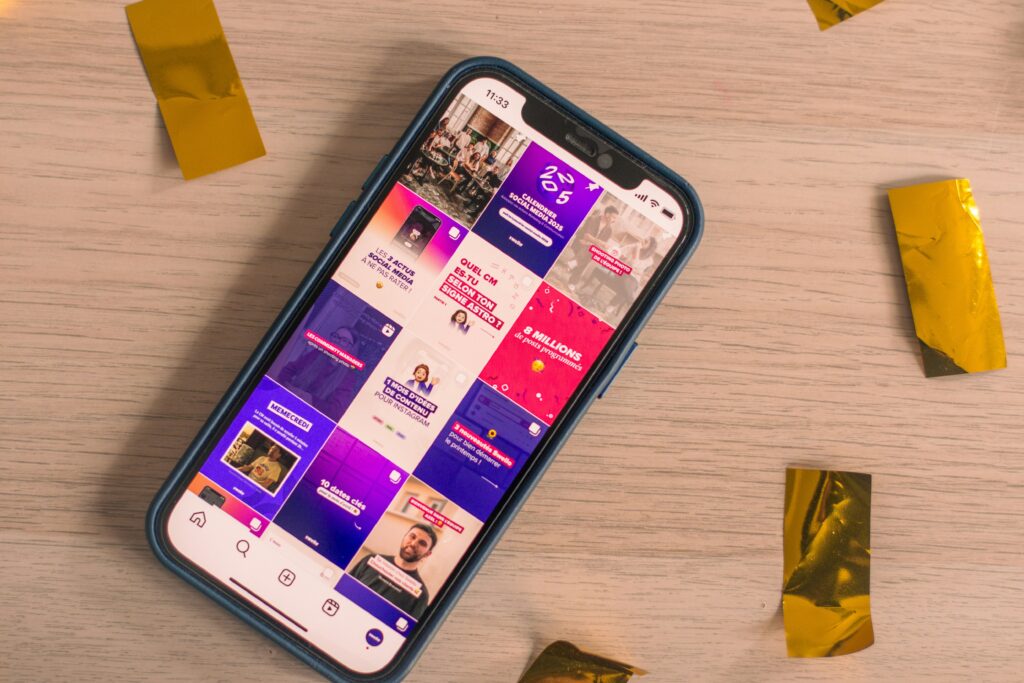
Several scheduling tools include a free resizer and a feed preview. The preview is the more valuable of the two, because it catches the problems that only appear in context — a carousel that jumps, an image cropped oddly in the grid, a palette that clashes with the eight posts around it.
Design tools cover the other half. Build templates at the exact sizes once and export directly, rather than resizing at the end, which is where quality is lost.
Resizers, and what they prevent
- Keep a master file with every variant (1:1, 4:5, 3:4, 9:16) so nothing starts from scratch.
- Avoid double compression: never download an image from Instagram or a messaging app and re-upload it. That file is already compressed and will be compressed again.
- Use the grid preview before publishing, not after, since the grid is the only place the palette is judged as a whole.
- Check a new ratio inside your scheduling tool before committing to it, because those tools update later than the platforms do.
Feed preview: seeing it in context
Individual posts are judged next to the posts around them. A preview is the only way to see that before it is public, and it is the step that separates a profile that looks designed from one that looks accumulated.
Avoiding the common upload mistakes
Five problems account for nearly every case of content that looked fine in the editor and wrong in the app.
Double compression first. Downloading an image from the platform and re-uploading it compresses an already-compressed file, and the loss is cumulative and irreversible. Always go back to the original export.
Upload on a stable connection. A failing upload can result in more aggressive compression, which is a quality problem caused entirely by circumstances outside the file.
Use PNG for fine text and gradients. JPG handles photographs well and sharp edges badly, and the artefacts appear exactly where the design is most deliberate.
Respect the safe zones in Stories and Reels. On the 1080 × 1920 canvas, 250 px at the top and 340 px at the bottom belong to the interface. That leaves a usable central band of 1080 × 1330, and everything that must be read belongs inside it.
Keep carousel slides identical in size, and keep text away from the edges where automatic cropping bites into letters.
Then run a four-question check before publishing: exported at the right size, text inside the safe zone, original file rather than a re-download, and previewed in context. It takes fifteen seconds and prevents most of the above.
| Problem | What to do |
|---|---|
| Double compression | Always upload the original export, never a re-download |
| Unstable connection | Upload on a reliable network to avoid heavier compression |
| Fine text or gradients | Export PNG rather than JPG |
| Safe zones | Keep readable content inside the central 1080 × 1330 |
| Carousels | Same ratio on every slide, text away from edges |
None of that is complicated. It is the difference between a workflow that produces consistent results and one where every upload is a small gamble.
What getting this right actually buys
Correct dimensions are not a technical nicety; they change two things that matter and nothing else.
The first is screen area. A post that fills more of the display holds attention marginally longer, and that is the signal distribution responds to. The effect per post is small and it compounds across a year of publishing.
Reach and engagement
More screen time per viewer means better distribution, which means more viewers. It is the one lever here that works without any additional creative effort: the same photograph, exported at the right ratio, performs better than it did.
A profile that reads as deliberate
The second is credibility, built from details: a sharp profile picture, highlight covers in one style, carousels that do not jump when swiped. None is noticed individually, and together they are the difference between a profile that looks run and one that looks abandoned.
The inverse is more visible. Cropped faces, soft images and inconsistent ratios read as a business that does not check its own work, and a viewer applies that inference to everything else.
Standardizing the formats also saves time, which is the benefit that actually gets felt. Create once, export to four ratios, reuse across campaigns. That is the return on an afternoon spent building templates.
Where to start
If you change one thing after reading this, change the template. Set it at 1080 × 1440 for feed and 1080 × 1920 for vertical video, with the safe zones marked as guides.
Then build the variants once rather than per campaign. The same master at 1:1, 4:5, 3:4 and 9:16 covers feed, Stories, Reels and ads, and adapts to other platforms with a crop rather than a redesign, once you know which format each platform rewards.
And expect this to move again. The feed ceiling went from square to 4:5 to 3:4 within a few years, each time without much warning. A workflow built on masters and variants absorbs the next change in an afternoon; one built on finished files at a single size does not.
Which is the real argument for any of this. The specific numbers in this article will age. The habit of designing from the final dimensions, keeping the original file and checking the preview before publishing will not, and the consistency matters more than the perfection. The formats these dimensions are built for change less often than the numbers do.
Frequently asked questions
What are the recommended Instagram post sizes now?
1080 × 1440 px (3:4) is the current ceiling and the one to design for. 1080 × 1350 (4:5) and 1080 × 1080 (1:1) both still work, and the widest supported ratio is 1.91:1 at 1080 × 566.
Why do the correct sizes matter?
Because the platform crops and compresses anything that does not fit, and because a post filling more of the screen is distributed better. The same image at the right ratio performs better than it did at the wrong one.
What size should the profile picture be?
Upload at 320 × 320 px or larger even though it displays at roughly 110 × 110. It renders as a circle, so centre the subject and keep the corners empty.
What are the dimensions for Stories?
1080 × 1920 px (9:16), full screen, with 250 px clear at the top and 340 px at the bottom for the interface. Each segment runs up to 60 seconds.
What should you know about ad sizes?
Feed ads at 1080 × 1440 (3:4), Stories and Reels ads at 1080 × 1920 (9:16). And note that the old rule limiting text to 20% of an ad image was withdrawn by Meta in 2020, despite still being widely repeated.