A squeeze page is a landing page that has been stripped down until only one thing is left: a field for an email address and a reason to fill it in. No menu, no sidebar, no second offer. That narrowness is the whole point, and it is why squeeze pages routinely convert several times better than the pages they replace.
What a squeeze page is
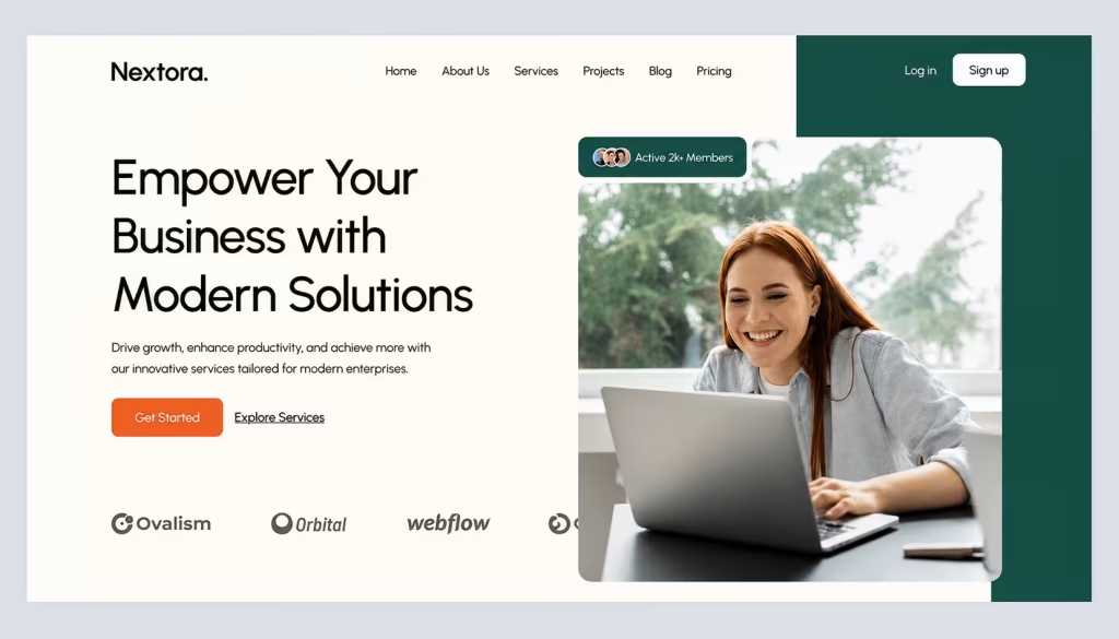
A landing page is any page built around a single conversion goal. A squeeze page is the narrowest version of that: it exists to capture a contact detail, usually an email address, in exchange for something the visitor wants. Everything else is removed, including the navigation, because every additional link is a way out.
Why the narrow version converts better
Three things happen when a page is reduced to one decision:
- There is nothing else to click. Removing the navigation and secondary offers sounds crude and is the single largest factor in how these pages perform.
- The message can be specific. A page serving one campaign and one audience can say something a general page cannot, because it does not have to work for everybody.
- The result is measurable. One page, one goal, one number. When it underperforms you know which thing failed.
What counts as a conversion here
Conversion is just the visitor doing the thing the page was built for, and it comes in two shapes:
- Direct conversion: the visitor buys, requests a quote, books a service. Money or a commitment changes hands.
- Indirect conversion: the visitor hands over a name, an email or a phone number in exchange for something free.
A squeeze page is the second kind, and that distinction matters when judging the numbers. A 30% conversion rate on an email capture and a 3% conversion rate on a checkout are not comparable figures, even though both get called conversion rate.
What goes on the page
Five decisions carry almost all of the outcome. In rough order of how much they matter:
One objective, and nothing competing with it
Decide what the page is for before writing a word of it: an email list, a webinar registration, a sample request. If a page has two goals it has none, and the second goal is usually the one somebody added later because it seemed free to include.
The headline has to carry the whole offer
The headline and the line beneath it are the only things most visitors read. Together they need to say what the person gets and why it is worth an email address. Vagueness here cannot be rescued by anything further down the page.
Images that show the actual thing
Use images that show the offer, not stock photography of people shaking hands. If the offer is a document, show the document. If it is software, show the screen. A generic image is worse than no image, because it tells the visitor the page was assembled rather than written.
The form: how many fields to ask for
Ask for the minimum the next step genuinely needs. Every field is a reason to leave, and the fields teams add “for the CRM” are the ones that cost conversions. If you only need an email to send the thing, ask for an email.
The call to action
Label the button with what happens when it is pressed. “Send” describes the mechanism; “Get the checklist” describes the outcome. Make it visually unmissable and do not make the visitor scroll to find it.
Three structures that work
Most effective squeeze pages follow one of three shapes. The first is the single screen: headline, one image, form, nothing below the fold. It works when the offer needs no explanation. The second adds a short proof section under the form — a few specifics about what is inside, or who else uses it — for offers that need one more reason. The third is the long-form version, used when the offer is substantial enough that the page has to do some selling, with the form repeated at intervals rather than once at the top.
Which shape to use follows from how much the visitor already knows. Cold traffic needs the second or third; people arriving from your own email list usually need the first.
Where a squeeze page sits among landing page types
Landing pages split into two families, and the squeeze page lives in one of them:
Pages built to be found
These attract traffic through search or content, and they are not squeeze pages.
- Launch page: announces a product or service.
- Home-page landing: the site’s front page with one clear action.
- SEO landing page: informational or transactional, built to rank.
Pages built to convert
These are built for traffic you send rather than traffic you attract.
- Product page: pushes a direct purchase.
- Squeeze page: asks for a contact detail in exchange for something of value. The narrowest and usually the highest-converting of the group.
- Click-through page: sells, then hands off to a checkout.
- Thank-you page: confirms the action and is where the next offer belongs, since the visitor has already said yes once.
Why the narrow focus works at all
The mechanism is subtraction rather than persuasion. A general page asks the visitor to choose among several possible actions, and choosing is work. A squeeze page asks for one decision with one visible way to act on it, and the lift comes from the options that are no longer there.
How much lift depends entirely on the traffic and the offer, so the figures published as benchmarks are close to meaningless. Measure the page you replaced against the page you built; that comparison is the only one calculated on your own audience.
What to test, and in what order
Test one thing at a time, and start with the elements that move the most. The headline first, because it is what most visitors read and the only thing a majority of them read. Then the offer itself — not how it is described, but what it actually is, since a page converting badly is often a page selling something nobody wanted.
Then the form, by removing a field rather than adding one. Then the button label. Then, last and least, the colours and layout that teams tend to test first because they are the easiest to change.
Run each test until the result is not noise. A page with two hundred visitors a week cannot resolve a two-point difference, and declaring a winner early is how teams end up confidently optimizing in the wrong direction.
Tools for building them
Any of these will do the job; the choice matters less than people expect:
- WordPress with Elementor Pro: pages, forms and the basic automated follow-up sequences inside a site you already own.
- Unbounce: built specifically for landing pages and testing them.
- HubSpot: landing pages tied into a CRM, which matters if the contacts need to go somewhere specific.
Check one thing before committing: how the tool exports its contacts. It is the only decision here that is hard to reverse later.
Where most squeeze pages lose people
Four failures account for most underperforming pages. The navigation was left in place, so visitors wandered off. The form asks for a phone number that nothing in the process needs. The offer is described in terms of its features rather than what it saves the reader. And the traffic is wrong — a page converting at 2% from cold advertising may be performing perfectly, since the problem is who is arriving rather than what they find.
The part nobody optimizes
A squeeze page is half of a system, and the other half is what happens after the email arrives. A page converting at 40% into a sequence nobody opens is worth less than one converting at 15% into a sequence that leads somewhere. The page is the easy half to measure and the cheap half to fix, which is why it gets most of the attention and the follow-up gets almost none. What happens on either side of a capture page decides whether it was worth building.
Frequently asked questions
What is a squeeze page?
A landing page reduced to a single purpose: capturing a contact detail, usually an email address, in exchange for something the visitor wants. It has no navigation and no competing offers.
What is a squeeze page for?
Building a list of contacts you can reach directly, rather than hoping people return to the site on their own. It converts attention you have already paid for into something you keep.
What should a squeeze page include?
A headline stating the offer, one image showing the actual thing, the shortest form the next step allows, and a button labelled with the outcome rather than the mechanism. Nothing else.
How do you build one?
Decide the single objective, write the headline before anything else, build the form with the fewest fields you can defend, and set up a thank-you page that confirms what happens next. Then test the headline before you test anything cosmetic.